An analysis of the Politics section of Kurir.rs shows how two rhetorical frames, “Blockaders/Chaos” and “Vučić/Stability”, can be tracked as daily time series.
‘Where I stopped – you will go!’
‘What I couldn’t – you will do!’
‘Where I couldn’t – you’ll arrive!’
‘Whatever we owe – you pay it off!’
(Bright graves – Čika Jova Zmaj – translated by Nikola Tesla)
1. Why words matter in election campaigns
Election campaigns are not only contests between parties, candidates, programmes, and organisational machines. They are also contests between words. Words shape how political actors are presented, how opponents are labelled, which emotions are activated in the audience, and which interpretive frame becomes dominant in public debate. A single word, taken in isolation, may not mean much. But when the same word, or the same group of words, is repeated day after day in the same political context, it stops being a mere linguistic detail and becomes a campaign signal.
Statistical analysis of such signals does not begin with the claim that we know anyone’s intention. It begins with a much more modest question: how often do particular expressions appear, when do they appear, does their use intensify around important election dates, and do different political frames move together or separately? This distinction is important. The purpose of this kind of analysis is not to infer editorial intent, coordination, or voter effects from word counts alone. The purpose is to make the public language of an election campaign measurable, verifiable, and open to discussion.
In this series, we examine one concrete example: the daily use of two politically meaningful groups of terms in the Politics section of Kurir.rs, from 1 January to 24 May 2026. The first group of terms is connected with “Blockaders” and “Chaos”, including their linguistic variations. The second group is connected with “Vučić” and “Stability”, again including relevant variations. These two groups were not chosen randomly. They represent two different rhetorical frames: one that can associate opposition or protest actors with blockade, disorder, and chaos; and another that can associate the president or the ruling side with stability, order, and continuity.
The statistical result behind this introduction is simple but important: these words are not treated as isolated quotations, but as daily count time series. This means that for each day we have the number of times each group of terms appeared. This approach allows campaign language to be analysed not only through impressions, but through temporal patterns.
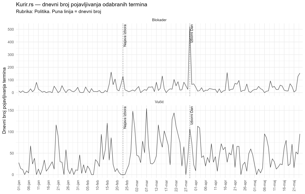
The first graph in this series should be read as a map of the terrain. By itself, it does not prove intent, coordination, or influence on voters. But it shows when particular political frames become more intense and where the days deserving closer attention are located. This is why counting words in election campaigns matters: it does not replace political analysis, but it gives that analysis a firmer empirical foundation.
2. Two rhetorical frames: “Blockaders AND Chaos” and “Vučić AND Stability”
Every election campaign produces certain images of political reality. One of the most common strategies is to portray the opponent as a source of risk, disorder, or danger, while presenting one’s own side as the guarantor of order, security, and stability. In this sense, the two groups of expressions tracked here have a clear analytical logic.
The logical operator AND means that an article is counted only if both selected terms appear in it, while OR means that an article is counted if at least one of the selected terms appears.
The first group, “Blockaders AND Chaos”, captures words that can function as a negative or delegitimising frame. In the political language of contemporary Serbia, the term “blockaders” does not merely denote participants in a blockade in a neutral descriptive sense. In certain media and political contexts, it can carry a negative connotation: suggesting obstruction, pressure, disorder, or irresponsibility. When this is combined with the word “chaos” and its variations, the resulting frame can portray political opponents or protest actors as producers of instability.
The second group, “Vučić AND Stability”, functions differently. It does not describe the opponent, but builds a positive frame around the government, the president, or the ruling political side. Stability is a powerful word in political communication because it does not simply mean the absence of crisis. It evokes order, predictability, control of the situation, and protection from uncertainty. When “chaos” and “stability” appear in public discourse as opposing concepts, the political scene is not presented only as a competition between different programmes, but as a choice between risk and security.
It is important to emphasise that this analysis does not assume in advance that these frames were intentionally constructed or centrally coordinated. Statistics alone cannot show that. What statistics can show is how often the frames appear, how their use changes over time, and whether those changes are temporally connected with key election events.
In this first part of the series, we therefore establish the foundation: words are treated as measurable traces of political communication. In the following parts, we will ask whether one frame was more frequent, whether the other was more explosive, whether they intensified in the same or in different periods, and what such patterns can mean for understanding the election-period media environment.
Statistically, we are not measuring whether particular claims are “true” or “false”. We are measuring frequency and timing. This is a narrower task, but it is much more verifiable. If one group of terms suddenly intensifies around an election, that is an empirical fact that can then be interpreted in context. If another group of terms remains high over a longer period, that is also a pattern that can be described. Distinguishing between such patterns will be important throughout the rest of this series.
3. What exactly was measured
The data used in this analysis come from the Politics section of Kurir.rs. The observation period runs from 1 January to 24 May 2026. The unit of observation is one day. For each day, we counted how many times each of the two term groups appeared.
However, the analysis does not use only the total number of term mentions. For each group of terms, there is also a related series: the number of articles in which those terms appeared. This is very important. Imagine a day on which a group of terms appeared 20 times. That can mean two very different things. It can mean that 20 different articles mentioned the frame once each. But it can also mean that only two articles repeated the same frame ten times each. The political meaning of these two situations is not identical.
For that reason, we introduce a measure called saturation. Saturation shows how many times, on average, a given group of terms is repeated per article in which it appears. If, on a given day, “Blockaders AND Chaos” is recorded 13 times in 3 articles, saturation is 13 divided by 3, or 4.33 mentions per article. If “Vučić AND Stability” is recorded 28 times in 4 articles, saturation is 7 mentions per article. This measure does not tell us how many articles were published in total on that day, nor the total volume of political content. It tells us something narrower but useful: how intensively a given frame was repeated inside the articles in which it appeared at all.
Table 1. Basic data description (download Excel file at the end of this post)
| Source | Section | Period | Number of days | Groups of terms | Additional article-count series |
|---|---|---|---|---|---|
| Kurir.rs | Politika | 1 Jan–24 May 2026 | 144 | Blokader; Vučić | Blokader_articles; Vučić_articles |
At this stage, it is especially important to distinguish between three types of numbers. The first is the total number of term mentions. This measures the overall volume of a rhetorical frame. The second is the number of articles in which those terms appear. This measures the breadth of the frame’s presence across articles. The third is saturation, or the number of mentions per article. This measures repetition intensity within relevant articles.
This distinction will matter in the second part of the series. There, we will see that total number of mentions and saturation do not necessarily tell the same story. One frame may appear in more articles, while another may be more concentrated or more explosive on particular days. That is precisely why it is useful to look not only at one series, but at pairs of series: terms and articles.
4. Which period and which events were analysed
Election language has a temporal structure. It matters whether a particular expression appears in January, months before the election; immediately after the official announcement; in the final week of the campaign; on election day itself; or after the election. For this reason, the analysis uses two key dates.
The first date is 23 February 2026, the official announcement of the local elections. The second date is 29 March 2026, election day. These dates allow the full observation period to be divided into more meaningful parts. The first part is the period before the official announcement. The second is the period from the announcement to election day, including both dates. The third is the period after election day.
This division is not just a technical detail. It reflects the natural political logic of a campaign. Before the official election announcement, political discourse may be intense, but it is not necessarily structured as immediate election communication. After the announcement, political actors and media enter a clearer campaign period. On election day, attention becomes concentrated. After the election, the discourse may calm down, but it may also remain elevated if results, protests, allegations, or political consequences continue.
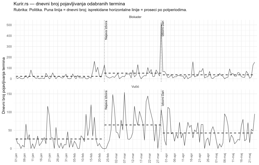
The graph should be read intuitively. Each point or line represents the daily number of mentions. The vertical lines mark key political dates. The horizontal lines, where shown, represent the average level in each subperiod. If the average line after the election announcement is higher than before the announcement, it means that the observed frame appeared more often in that period. If the line on or around election day is exceptionally high, this points to a concentration of language around the election event.
In this first post, we will not yet draw final conclusions about which frame was dominant or statistically elevated. That is the task of the following parts. Here, it is enough to understand how the timeline is organised and why 23 February and 29 March are analytically important dates.
5. First visual impression: two frames, two different dynamics
Even the basic time-series graph suggests that the two rhetorical frames do not behave in exactly the same way. This is the key intuition that the later parts of the series will examine more systematically.
The “Vučić AND Stability” frame appears to be broader and more persistent. It is present over a longer period and shows elevated values in several parts of the campaign period. This is consistent with the political function of the word “stability”: it is usually not used only for one event, but as a continuing message about continuity, security, and control.
The “Blockaders AND Chaos” frame appears different. It is visibly more volatile, with sharper spikes. Particularly important is the very strong spike on election day, which will be examined in more detail later in the series. Such a pattern suggests that the negative frame may not be evenly distributed across the entire campaign. It may instead be activated or intensified at specific politically sensitive moments.
These visual differences are not yet formal statistical proof. The graph is the beginning of the analysis, not its conclusion. But a good graph performs an important function: it shows us where to look more carefully. In this case, the graph points to several questions. Do both frames intensify after the election announcement? Is one frame more frequent in total volume? Does the other have larger individual spikes? Do the terms appear in more articles, or are they repeated many times inside a smaller number of articles? Do the patterns change after election day?
The most important intuitive result of this first visual overview is that we are not simply looking at “more” or “fewer” words. We are looking at different forms of political framing. One frame may be broader and more stable, while another may be more explosive and tied to specific political moments. In this sense, time-series analysis of language allows public discourse to be viewed dynamically, not merely as a collection of quotations.
6. What this analysis can and cannot yet say
It is important to define the limits of interpretation from the very beginning. Counting words is not the same as analysing intent. If an expression appears frequently, that does not prove why it was used. If it intensifies around election day, that does not by itself prove that it was part of a coordinated campaign. If two frames appear in the same period, that does not automatically mean that they are editorially or politically connected in a way that statistics alone can demonstrate.
What this analysis can show is different, but still important. It can show frequency, timing, change over time, intensity within articles, and the relationship between different rhetorical frames. It can show that some expressions appear more often after a particular date. It can show that one frame is more widespread, while another is more concentrated. It can show that certain spikes occur around election events. All of these are relevant findings for media monitoring.
What this analysis cannot show by itself is editorial intent, instructions from political actors, coordination between media outlets, or effects on voters. For that, other types of evidence would be needed: qualitative analysis of articles, analysis of headlines and visual presentation, comparison with other media, interviews, documents, audience data, or public opinion research. Statistical word-count analysis is one layer of evidence, not the whole picture.
This is why the series uses cautious language. Instead of claiming that a particular pattern “proves propaganda”, it is more precise to say that the data show increased frequency, temporal concentration, or patterns consistent with a particular form of political framing. Such an approach is less sensational, but analytically stronger.
7. What comes next in the series
This first part has established the basic question: why it is worth measuring politically meaningful words during an election period, and what exactly is being measured in this case. The next three parts move from introduction to results.
The second part will focus on descriptive findings. It will compare total mentions, article counts, saturation, and averages across subperiods. It will answer the question of which frame was more frequent, which was more widely present across articles, and which was more intense inside articles. Special attention will be paid to whether the patterns changed after the official election announcement and around election day.
The third part will introduce formal models for count time series. Since the analysis deals with counts of mentions rather than ordinary continuous variables, it uses models suitable for count data. Readers will be given an intuitive explanation of what a Poisson model means, why overdispersion matters, why the negative binomial model is often more appropriate, and how incidence rate ratios should be read. The purpose will not be to overload readers with statistics, but to explain why models help distinguish a visual impression from a systematic pattern.
The fourth part will return to interpretation and limits. It will examine what statistics can and cannot show. In particular, it will consider whether the two rhetorical frames move together, whether their timing overlaps or diverges, and why this kind of analysis is relevant for media monitoring and election integrity. The conclusion of this first part is simple: words in a campaign are not merely decoration in political communication. When they are repeated often enough, and when their appearance changes around key election dates, they become data. Those data do not tell us everything, but they tell us enough to deserve careful, transparent, and statistically disciplined analysis.
Data, code, and reproducibility
For full transparency, all materials needed to check and reproduce the analysis are made available with this post. Readers can download the R code used to collect data from the Kurir.rs website, the raw daily data used in the analysis in Excel format, and the R code used to generate all graphs, tables, and statistical results presented in this series.
These files allow readers to verify how the data were collected, how they were processed, and how the reported results were produced. The code can also be adapted to analyse other terms, other media outlets, or other election periods. The aim is not only to present the findings of this specific analysis, but also to encourage wider use of reproducible methods in media monitoring and election forensics.
Available files in Kurir_analiza.zip file:
R code for data collection
Raw data in Excel format
R code for generating tables, graphs, and models
Download Kurir_analiza.zip file:
Readers who would like to repeat the analysis using the provided R code, but need additional explanation of the code structure, parameter settings, or how to adapt the analysis to other terms, are welcome to contact me for clarification.

Director of Wellington based My Statistical Consultant Ltd company. Retired Associate Professor in Statistics.
Has a PhD in Statistics and over 45 years experience as a university professor, consultant, international researcher and government advisor.