The final part of the series explains how to interpret the “Blockaders/Chaos” and “Vučić/Stability” patterns without overstating the evidence, but also without ignoring its importance.
1. From models to interpretation: why the final step is the most sensitive
In the previous three parts of the series, we built the analysis step by step. First, we explained why politically meaningful words can be treated as data. Then we presented descriptive results: total counts, article counts, saturation, subperiods, and election windows. In the third part, we used count models to assess whether the visible patterns were statistically systematic.
We now come to the most sensitive part: interpretation. Statistical results never speak entirely for themselves. They show patterns, but those patterns must be translated into careful and clear claims. If a term appears more often during an election period, that is a relevant finding. If there is a major election-day spike, that is also relevant. If two rhetorical frames have different dynamics, that is another important result. But none of these findings should automatically be turned into a claim about intent, coordination, or effects on voters.
The purpose of this final part is therefore twofold. First, we summarise what has actually been established. Second, we explain clearly what cannot be concluded from these data. This is especially important in election analysis, where the temptation to overinterpret is strong. Numbers can look very persuasive, but their strength depends on whether they are interpreted within the limits of what they actually measure.
Table 1. Summary of the main findings — what was shown descriptively, what was supported by models, and what remains open
| Area of finding | What was shown descriptively | What was supported by the models | What remains open |
|---|---|---|---|
| Total volume of mentions | The “Vučić/Stability” frame had a higher total number of mentions than the “Blockaders/Chaos” frame during the observed period. | The pooled negative binomial model does not suggest that the simple difference between the two frames is the most important finding; differences across time windows are more important. | The total count alone does not explain why the terms were used, nor whether they were used in the same tone or context. |
| Number of articles | “Vučić/Stability” appeared in a larger number of articles, suggesting broader distribution of this frame within the Politics section. | The formal models primarily modelled daily term counts, not article counts; article counts were used as a descriptive measure of breadth of presence. | It would be useful to know the total number of political articles per day in order to measure term use relative to all political content. |
| Term saturation | “Blockaders/Chaos” had slightly higher average saturation, meaning that when it appeared in an article, it was repeated somewhat more intensively on average. | Saturation was not modelled using Poisson or negative binomial models because it is a ratio, not a count variable of the same type. | Saturation does not tell us anything about tone, article length, headline placement, visual presentation, or editorial context. |
| Change after election announcement | Both frames intensified strongly in the period from the election announcement to election day, compared with the period before the announcement. | The models confirm that some pre-election windows were associated with higher expected daily term counts. | Temporal alignment with the election announcement does not prove that the announcement was the only cause of the increase. |
| Election day | “Blockaders/Chaos” had an exceptional election-day spike, far above its usual level and other days in the series. | The term-specific negative binomial model confirms that election day is the strongest and most stable statistical finding for the “Blockaders/Chaos” frame. | The election-day spike alone does not prove intent, coordination, or effects on voters; qualitative reading of the articles from that day is needed. |
| Broader pre-election period | “Vučić/Stability” shows a broader and more persistent pre-election pattern, with elevated values across several pre-election windows. | Term-specific models confirm that the “Vučić/Stability” frame was systematically elevated in several pre-election windows and immediately after election day. | It remains open whether this pattern is specific to Kurir.rs or appears across other media outlets as well. |
| Different dynamics of the two frames | Descriptively, “Vučić/Stability” appears as a broader and more stable frame, while “Blockaders/Chaos” is more volatile and more explosive. | Interaction models support the interpretation that the two frames do not intensify in the same way: stability is more pronounced across the broader pre-election period, while chaos culminates on election day. | The models show different temporal dynamics, but they cannot by themselves explain the political or editorial function of those patterns. |
| Co-movement | Same-day correlations between the two series are weak, meaning that the two frames do not simply move together day by day. | Correlation and cross-correlation results suggest that the relationship between the frames is more temporally complex than direct same-day co-movement. | Cross-correlations are exploratory and sensitive to large spikes; they should not be interpreted as proof of leading, lagging, or coordination. |
| Change-points | Visually and descriptively, there are periods in which the intensity of the series changes, especially around the election announcement and election day. | Change-point analysis identifies changes around the election announcement for “Vučić/Stability” and around election day for “Blockaders/Chaos”. | Change-points do not explain the cause of change; they only mark dates around which the statistical behaviour of the series changes. |
| Limits of inference | The data clearly show frequency, timing, intensity, saturation, and differences between the two rhetorical frames. | The models provide stronger support for the claim that the election period has a distinct statistical dynamic in the analysed series. | Statistics alone do not prove intent, coordination, a propaganda plan, truthfulness of claims, or effects on voters. |
Intuitively, this final part should be read as a guide to responsible interpretation. Statistics do not tell us everything about political language, but they tell us enough to identify patterns that would otherwise remain at the level of impression. That is where their value lies for media monitoring and election integrity.
2. The two frames do not tell the same statistical story
The main overall finding of the series is that “Blockaders AND Chaos” and “Vučić AND Stability” do not behave like two versions of the same pattern. They represent two different rhetorical frames with different temporal dynamics.
The “Vučić AND Stability” frame has a higher total number of mentions and appears in more articles. Descriptively, it is the broader frame. The model-based analysis shows that it is systematically elevated in several pre-election windows, especially from 30 to 15 days and from 14 to 8 days before the election, as well as in the final week before the election. It also remains elevated in the first week after election day. This makes it a more durable campaign-period frame.
The “Blockaders AND Chaos” frame has a different profile. It is less frequent in the overall total, but it has slightly higher average saturation and an extremely strong spike on election day. The term-specific negative binomial model shows that election day is statistically exceptional for this frame: the expected number of mentions was many times higher than in the reference period. In the descriptive data, that day contains 521 mentions in 48 articles.
Before the heatmap, it is useful to explain how the figure should be read. A heatmap is a graph that uses colour to represent intensity. In this case, each row represents one group of terms, and each column represents one day. Instead of asking the reader to follow only a line over time, the heatmap makes it easier to see when a term group was unusually frequent, when it was less present, and whether periods of higher intensity overlap or differ between the two rhetorical frames.
In a standardised heatmap, we are not looking at absolute counts, but at relative intensity within each series. This means that “Blockaders/Chaos” is compared with its own usual level, while “Vučić/Stability” is compared with its own usual level. This is useful because one series may have a higher total number of mentions than the other, and a raw-count heatmap could easily hide relative spikes in the less frequent series.
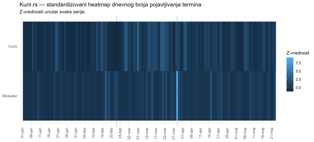
In this heatmap, pale blue or very light cells indicate days when a given frame was substantially above its own usual level. Dark blue cells indicate days when the frame was close to its average level or below its usual level. Therefore, pale blue does not necessarily mean that the absolute number of mentions was higher than for the other term group. It means that the day was especially intense for that specific series.
For the “Blockaders/Chaos” frame, the heatmap shows a clear concentration of high intensity around election day. This is consistent with the earlier findings: this frame is not the highest in total volume across the whole period, but it has an exceptional election-day spike. For the “Vučić/Stability” frame, the darker cells are more spread across the broader pre-election period, which fits the interpretation of a more stable and persistent campaign frame. In other words, the heatmap helps readers visually distinguish between an explosive frame and a broader, more continuous frame.
Another thing we can “read” from the heatmap is that the highest-intensity days do not always coincide across the two series. This supports the conclusion that the two frames did not simply rise and fall together day by day. Rather, both belong to the same election-period media environment, but they have different temporal profiles: stability is more visible across a broader period, while chaos stands out most sharply at the moment of highest election concentration.
This finding matters because it moves the discussion away from the simple question “which frame appeared more often?” and toward the better question: “how did the frames behave over time?” Stability is a broader and more durable message. Chaos is sharper, more volatile, and especially concentrated on election day. These are different communicative functions, at least at the level of statistical pattern.
Intuitively, we can say that the stability frame builds the campaign background, while the chaos frame produces a strong election-day shock. This is not a claim about intent. It is a description of different temporal profiles.
3. Do the two frames move together?
A natural question is whether the two frames intensify at the same time. If “Blockaders AND Chaos” and “Vučić AND Stability” moved together day by day, we could speak of strong daily co-movement. If they do not move together, then we are seeing two related but temporally different patterns.
The results show weak daily association. The Pearson correlation between the two series is about 0.159, while the Spearman correlation is about 0.044. Pearson correlation measures linear association between daily values. Spearman correlation measures whether the ranks of the values move together. Both values are low. This means that days with high counts for one frame are not consistently the same days with high counts for the other frame.
This result is important because it prevents a simplified interpretation. The two frames are part of the same broader election-period media environment, but they do not simply intensify on the same days. Stability has a broader pre-election character, while chaos culminates on election day. Their connection therefore lies less in same-day correlation and more in the fact that both gain political meaning within the same election period.
Cross-correlation analysis additionally asks whether one frame may lead or lag the other. The results contain some signal at shifted lags, but this should be interpreted cautiously. With only two series, a relatively short period, and large individual spikes, cross-correlation can be sensitive to a small number of extreme days. This result should therefore be treated as exploratory rather than as central evidence.
Leaving these issues aside, the cross-correlation graph suggests that increases in the “Vučić/Stabilnost” frame may have tended to precede increases in the “Blokaderi/Haos” frame by roughly one week (the cross-correlation coefficient at lag 7 has a maximum value of approximately 0.35). However, due to the problems mentioned above, it should be read as an exploratory finding about temporal connection, and not as evidence that one frame caused the other or that their use was coordinated.
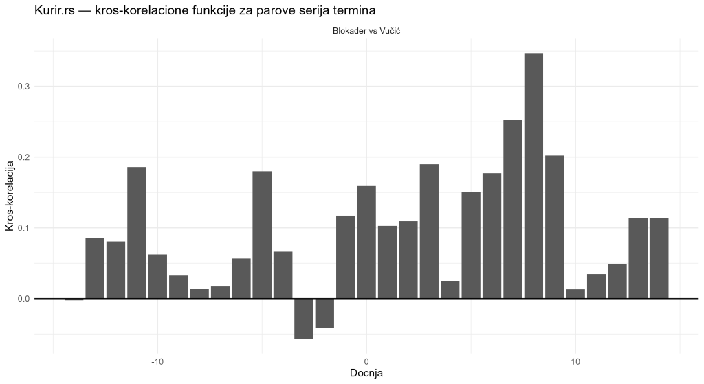
The intuitive conclusion is this: the two frames did not simply rise and fall together day by day. They are better understood as two different patterns within the same election environment. This matters for public interpretation because it shows that the “negative” and “positive” frames do not necessarily function as mirror images of each other.
4. Change-points: when the series statistically change
Change-point analysis helps identify dates around which the statistical behaviour of the series changes. This may mean a change in average level, variability, or both. In public interpretation, it is important to stress that a change-point is not an explanation. It is a signal that around a particular date, the series began to behave differently.
The results are consistent with the main story of the series. For the total term count, change-points are detected immediately around election day. For “Blockaders AND Chaos”, change-points appear around 28 and 30 March, matching the enormous spike on election day, 29 March. For “Vučić AND Stability”, change-points appear around 21 and 24 February, around the official election announcement on 23 February.
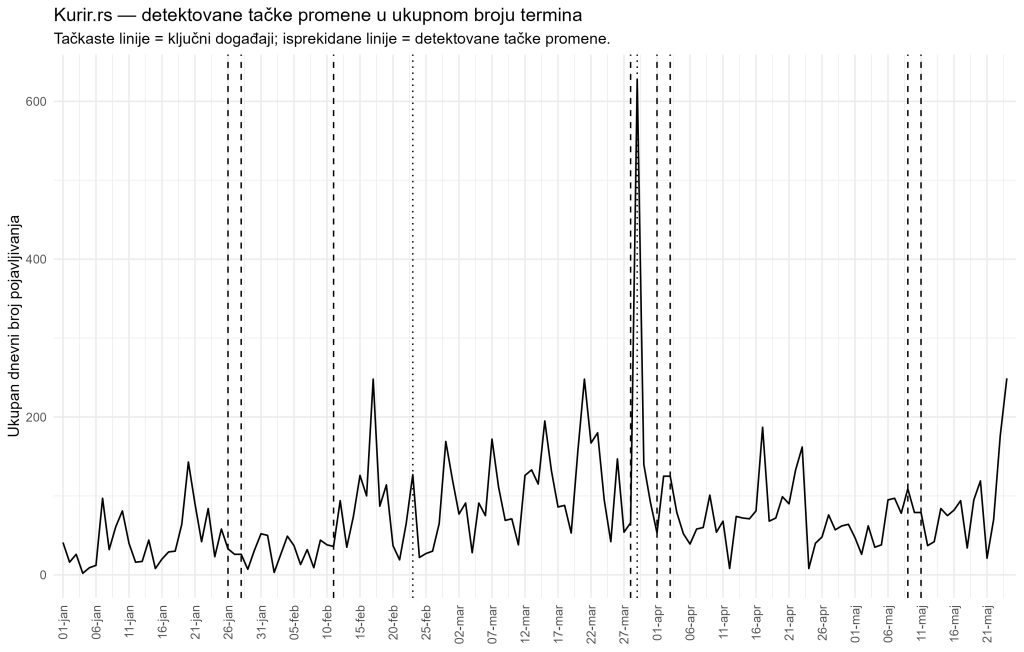
This is useful supporting evidence. It suggests that the stability frame changes statistically around the entry into the formal election period, while the chaos frame changes statistically around election day itself. In other words, the two frames have different political timing points of intensification.
But change-point analysis has limitations. The algorithm can also detect short local changes, especially when the data are very volatile. If two change-points appear only a few days apart, this may indicate a brief intense burst rather than a lasting structural shift in the whole series. Change-points should therefore be interpreted together with graphs, tables, and qualitative reading of the articles.
Intuitively, change-points should be read as warning signs: “the series behaves differently here.” They do not explain on their own why the change happened. That second step requires context.
5. What statistics can show
After four parts of the series, we can state more precisely what statistics can show in this analysis. They can show frequency: how many times the two groups of terms appeared during the observed period. In this case, “Vučić AND Stability” has the higher total number of mentions, while “Blockaders AND Chaos” has the exceptional election-day spike.
Statistics can also show distribution across articles. We know how many articles contained the observed terms, which allows us to distinguish a frame that appears across a larger number of texts from a frame that may be more concentrated in fewer articles. In this analysis, the stability frame appeared in a larger number of articles.
A third important indicator is saturation, meaning the average number of term mentions per article. This measure shows how intensively a given frame is repeated within relevant texts. Here, “Blockaders AND Chaos” is somewhat higher, suggesting stronger repetition within the articles in which that frame appears.
Statistics can also show changes across subperiods and election windows. Both frames intensified after the official election announcement and remained above their initial levels after election day. The models then check whether these patterns remain visible in a more formal framework. The negative binomial models support the finding that the election period is associated with higher expected term counts, but also that the two frames intensify differently.
Finally, correlations, cross-correlations, heatmaps, and change-points can help us see whether the series move together, when their behaviour changes, and which dates should be checked more closely through qualitative reading of the actual articles.
Table 2. “What statistics can show” — frequency, articles, saturation, subperiods, models, correlations
| What we can claim | Based on what | Careful wording for the text |
|---|---|---|
| One frame may be more frequent in total volume. | Total number of mentions and average daily term count. | “During the observed period, the ‘Vučić/Stability’ frame had a higher total number of mentions than the ‘Blockaders/Chaos’ frame.” |
| One frame may be more widely distributed across articles. | Number of articles in which the terms appeared. | “The ‘Vučić/Stability’ frame appeared in a larger number of articles, suggesting broader distribution across the Politics section.” |
| One frame may be repeated more intensively within articles. | Saturation, or mentions per article. | “The ‘Blockaders/Chaos’ frame had slightly higher average saturation, meaning that when it appeared, it was repeated somewhat more intensively within relevant articles.” |
| We can identify changes across election-related subperiods. | Averages before the election announcement, from announcement to election day, and after election day. | “Both frames intensified after the official election announcement and remained above their initial levels after election day.” |
| We can assess whether the patterns are systematic rather than only visual. | Poisson, quasi-Poisson, and negative binomial models. | “The models support the finding that the election period is associated with higher expected term counts.” |
| We can distinguish the temporal dynamics of the two frames. | Term-specific models, interaction models, and election windows. | “The stability frame shows a broader pre-election pattern, while the chaos frame culminates on election day.” |
| We can examine whether the series move together. | Pearson and Spearman correlations, cross-correlations, and heatmap displays. | “Same-day association between the two series is weak, suggesting different temporal profiles.” |
| We can identify dates or periods for further qualitative reading. | Highest-count days and detected change-points. | “Statistics indicate which dates should be checked more closely through reading the actual articles.” |
This is a substantial contribution. Statistical analysis does not need to prove everything in order to be useful. Its value lies in separating impression from measurable pattern. It gives public debate a firmer basis: instead of saying “there seemed to be a lot of this language”, we can say how much, when, in which articles, and in which time windows.
6. What statistics cannot prove by themselves
It is equally important to state what this analysis cannot prove. First, it cannot prove intent. The fact that a term appears frequently does not, by itself, tell us why it was used. Intentions cannot be read directly from frequencies.
The analysis also cannot prove coordination by itself. In this case, we are observing one portal and one section. Even if similar patterns appeared across several media outlets, that would be evidence of temporal alignment or a shared pattern, but not proof of instruction, agreement, or central coordination.
Third, this analysis cannot prove effects on voters. To claim that particular language changed attitudes or voting behaviour, we would need data on audiences, exposure, attitudes, and voter behaviour. This analysis concerns media content, not audience reactions.
Count analysis also cannot replace qualitative reading of the articles. Counts show when and how much, but they do not read headlines, irony, context, quotations, visual presentation, or argumentative structure. Nor do they assess the truthfulness of individual claims, because counting terms is not the same as fact-checking.
For that reason, statistical results should be used as a map for further investigation, not as a final verdict. They show where the patterns are strongest, which days are unusual, and where closer reading of the actual texts should be directed.
Table 3. “What statistics cannot prove” — intent, coordination, voter effects, context, truthfulness of claims
| What should not be claimed from these data alone | Why statistics cannot prove it by themselves | Careful alternative |
|---|---|---|
| That there was an intention to delegitimise particular actors. | Term frequency shows how often an expression appears, but it does not reveal editorial or political intent. | “The data show a pattern consistent with negative framing, but they do not prove intent.” |
| That there was a coordinated campaign. | The analysis covers one portal and one section; even similar patterns across multiple media outlets would not by themselves prove agreement or instruction. | “The findings indicate temporal intensification of certain frames; claims about coordination require additional evidence.” |
| That these expressions affected voters. | There are no data on audiences, exposure, attitudes, or voting behaviour. | “The analysis concerns media content, not the effects of that content on voter behaviour.” |
| That every article has the same tone or function. | Count analysis does not read headlines, irony, context, quotations, visual presentation, or argumentative structure. | “The quantitative findings should be a starting point for qualitative reading of the actual articles.” |
| That individual claims in the articles are true or false. | Counting terms is not fact-checking and does not verify the content of each claim. | “The analysis measures the appearance of terms, not the truthfulness of individual statements.” |
| That the election announcement was the only cause of the increase. | Temporal alignment does not prove causality; other political or media events may also matter. | “The increase is temporally aligned with the election period, but causality should be interpreted cautiously.” |
| That change-points explain what happened. | Change-point analysis marks a change in the statistical behaviour of a series, but does not explain the cause of that change. | “Change-points show when the series changes, not why it changes.” |
| That one graph is enough for a final conclusion. | Graphs display patterns, but they should be read together with tables, models, and context. | “Conclusions are based on the combination of descriptive results, models, and cautious contextual interpretation.” |
Intuitively, statistics are like a spotlight. They illuminate parts of the terrain that deserve closer attention. But the spotlight is not the whole terrain. It shows where the patterns are; why they emerged must be investigated with additional methods.
7. Why this analysis matters for media monitoring
Media monitoring during an election period often relies on qualitative assessments, examples, tone analysis, balance, and actor visibility. All of these are important. However, the analysis of daily count series adds something different: measurability and temporal precision.
Instead of relying only on several characteristic examples, we can follow every day systematically. We can see whether a particular frame intensifies after the official election announcement. We can see whether election day contains exceptional values. We can compare article counts and saturation. We can check whether patterns remain visible after the election.
This kind of analysis is especially useful for journalists, civil society organisations, election observers, and researchers who want to monitor the media environment without relying only on subjective impressions. It does not solve everything, but it brings discipline into the discussion. If someone claims that a particular frame intensified during the campaign, daily data can test whether that claim is supported.
BOX: Why does count analysis help media monitoring?
Count analysis helps because it turns political language into time-based, verifiable data. Instead of relying only on the impression that a term appeared “often”, we can measure how many times it appeared, on which days, in how many articles, and with what average level of saturation.
Its first advantage is systematic tracking: every day is examined in the same way. Its second advantage is temporal precision: we can see whether a frame intensifies before the election, on election day, or after the election. Its third advantage is reproducibility: if the code and data are available, other researchers can check the results. Its fourth advantage is comparability: the same method can be applied to other terms, other media outlets, and other election periods.
For this reason, count analysis does not replace traditional media monitoring; it complements it. It does not tell us everything about tone, context, and meaning, but it shows where the patterns are strong enough to deserve closer reading.
8. Why this is relevant for election integrity
Election integrity does not depend only on voting procedures, voter lists, vote counting, and the work of election commissions. It also depends on the information environment in which voters form political views. If the public space is saturated with particular political frames, especially frames that associate some actors with chaos and others with stability, this becomes relevant for understanding the quality of the campaign.
This does not mean that every frequent word is a problem. Media have the right to report, comment, and use political language. The issue for monitoring is whether we can understand whether particular frames intensify systematically, when they intensify, and how they relate to the election calendar. Statistics do not introduce censorship. They introduce transparency.
In this analysis, the most important finding is not one isolated number. The most important finding is the combination of patterns: both frames intensify after the election announcement; the stability frame is broader and more durable; the chaos frame has an exceptional election-day spike; the two frames do not show strong same-day co-movement; and the model results confirm that the election period has a distinct statistical dynamic.
This is relevant for election integrity because it shows how an election campaign can be monitored through language patterns. Election forensics is not only the analysis of vote results. It can also include the analysis of the information environment, media frames, and the ways political alternatives are presented to the public.
Intuitively, the ballot is the end of the electoral process, but political language is part of its beginning. If we want to understand elections, we cannot follow only votes. We also need to follow the messages that shape the environment in which votes are formed.
9. What would strengthen the analysis further
This analysis is deliberately limited and therefore transparent. It examines one portal, one section, two rhetorical frames, and one time period. That is enough for a serious initial insight, but not enough for final conclusions about the entire media system.
First, it would be useful to add other portals and media outlets. If the same patterns appeared in other pro-government media, one could speak about a broader media pattern. If the patterns differed, that would also be an important finding.
Second, it would be useful to distinguish headlines, subheadings, and body text. A word in a headline has a different weight from a word in a long article. Headlines are more visible, often circulate on social media, and more strongly shape first impressions.
Third, it would be useful to include the total number of political articles per day. This would make it possible to calculate the rate of term use relative to all political content, not only the number of articles in which the observed terms appeared.
Fourth, the highest-count days should be qualitatively coded: were the articles informative, commentary-based, attacking, neutral, quotation-driven, or editorially framed? Count analysis tells us how much and when; qualitative analysis tells us how.
Fifth, the analysis could be extended to other terms and other opposing frames: “violence/order”, “foreign factor/national interest”, “crisis/stability”, “betrayal/patriotism”, and similar pairs.
Table 4. Possible extensions — other media, headlines, total article volume, qualitative coding, new terms
| What could be added | Why it would strengthen the analysis | What it would help test |
|---|---|---|
| Other portals and media outlets | Analysis of one portal shows a pattern in one media space, but does not show whether the pattern is broader. | Whether the same rhetorical frames appear in other media and whether they have similar temporal dynamics. |
| Comparison of pro-government, opposition, and more neutral media | Different media may use different frames, intensities, and tones. | Whether the observed pattern is specific to one type of media or appears across the broader media system. |
| Headlines, subheadings, and body text analysed separately | A word in a headline is more visible and may have a stronger effect on the reader’s first impression. | Whether political frames appear mostly in headlines or are mainly repeated in the body of articles. |
| Total number of political articles per day | Without total article volume, we do not know whether term growth simply follows growth in overall political coverage. | Whether the relative rate of term use increases, not only the absolute number of mentions. |
| Qualitative coding of highest-count days | Counts show when something was unusual, but they do not explain tone, context, or narrative. | Whether high-count days are linked to specific events, editorial commentary, quotations, or campaign messages. |
| Distinction between news and commentary articles | The same term may serve different functions in news reports, comments, interviews, or opinion pieces. | Whether politically significant terms are used mainly in informational reporting or in commentary frames. |
| Analysis of visuals and images | Headlines and images often work together to create a political frame. | Whether the terms are accompanied by visual elements that reinforce messages of chaos, stability, threat, or control. |
| New terms and new pairs of frames | One pair of terms cannot capture the whole campaign language. | Whether similar dynamics appear in pairs such as “violence/order”, “crisis/stability”, “betrayal/patriotism”, or “foreign factor/national interest”. |
| Longer time period | Several months provide useful evidence, but not whether the pattern is part of a longer-term practice. | Whether election-period patterns are a continuation of earlier media language or a campaign-specific intensification. |
| Connection with political calendar events | Spikes in the data often require political context. | Whether changes in the series are linked to rallies, protests, statements, incidents, parliamentary sessions, or other public events. |
These limitations are not a weakness if they are clearly stated. On the contrary, they make the analysis more reliable. A good statistical text does not claim more than the data allow. It shows what was found, where the boundaries are, and what should be checked next.
10. Conclusion of the series: words as measurable traces of election communication
This series began with a simple idea: words in an election campaign can be counted, tracked over time, and analysed as data. Using the Politics section of Kurir.rs, we followed two rhetorical frames: “Blockaders AND Chaos” and “Vučić AND Stability”.
The results show a nuanced picture. “Vučić AND Stability” is more frequent overall and more widely present. Its intensity rises across the broader pre-election period and remains visible immediately after the election. “Blockaders AND Chaos” is less frequent in the overall total, but more explosive, has slightly higher saturation, and shows an exceptional spike on election day. The two frames do not show strong same-day co-movement, but both belong to the same broader election-period communication environment.
The most important contribution of this analysis is not one table or one graph. Its value lies in the method. It shows how media language can be monitored transparently, daily, reproducibly, and with statistical discipline. This is useful for researchers, journalists, civil society organisations, and election observers.
In the end, statistics do not close the debate. They open it in a better way. Instead of relying only on impressions, we can discuss data. Instead of claiming more than we know, we can clearly state what was measured, what was modelled, what is visible, and what remains to be checked. This is why the analysis of political language is an important addition to election forensics. Elections do not take place only at polling stations. They also take place in the language through which the public is told who brings stability and who supposedly brings chaos.

Director of Wellington based My Statistical Consultant Ltd company. Retired Associate Professor in Statistics.
Has a PhD in Statistics and over 45 years experience as a university professor, consultant, international researcher and government advisor.