1. From the aggregate result to the internal structure of the vote
The first part established the broad meaning of the Ada referendum result: the municipality voted clearly for “No”, and that outcome carries at least some political weight in the local context. But aggregate numbers do not tell us how such a result was built. For that, one has to move inside the municipality and look at the polling-station level (I thank the student Jovan Todorov for the data sent).
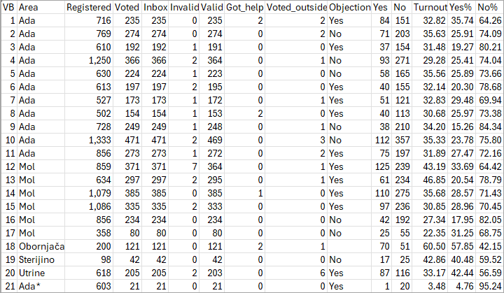
This second part does exactly that. Its aim is not to prove irregularity, but to examine how the result varied across stations, whether certain administrative markers such as objections are associated with different patterns, and whether a few stations play a disproportionate role in shaping the municipality-wide outcome.
2. Turnout and the referendum result
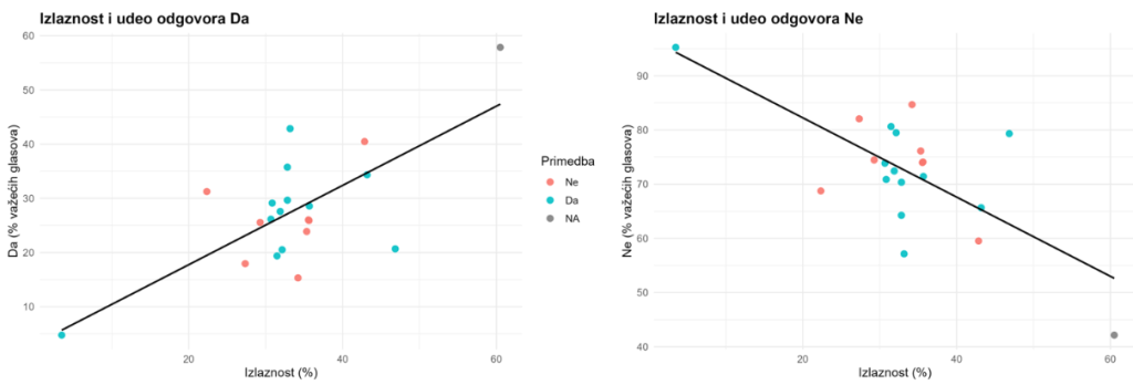
One of the clearest exploratory findings in the dataset is the relationship between turnout and the referendum result. Polling stations with higher turnout tended, on average, to record higher Yes shares and lower No shares. The correlation is fairly strong in both directions. This pattern is visible both in the correlation matrix and in the scatterplots.
Substantively, that result is interesting because it complicates any simplistic reading of the referendum. Municipality-wide, “No” dominated decisively. But at the internal level, the stations that mobilized more voters were, on average, somewhat less hostile to the proposal. This does not make the aggregate No result any less real, but it does suggest that the municipality-wide outcome was produced by combining rather different local political micro-environments.
There are several possible explanations for such a pattern. It could reflect social composition, different local networks of mobilization, stronger issue salience in some settlements, or even the simple fact that smaller and weaker-turnout stations may behave more erratically. The data do not let us choose confidently among those explanations. What they do allow us to say is that turnout is one of the main dimensions along which the referendum result varied.
3. Correlation analysis: what moves together
The correlation matrix is best used here as a map of the dataset rather than as a source of strong conclusions. The most relevant association is the positive correlation between turnout and Yes% (+0.70), and the corresponding negative correlation between turnout and No% (-0.70). That is the central relationship in the file.
A second point worth noting is that Yes% is moderately positively associated with both outside voting (+0.46) and assisted voting (+0.53). Those associations are not strong enough to support dramatic claims, especially on a sample of only 21 stations, but they are large enough to deserve mention. Stations with more Yes votes tended, on average, to show somewhat more voting outside the polling station and somewhat more assisted voting.
By contrast, invalid ballots do not appear to structure the referendum outcome in a major way. Their rate is low overall and only weakly associated with the Yes/No split (-0.06). That matters because it suggests that the result was not meaningfully driven by variation in ballot validity.
The safest interpretation is therefore that the internal structure of the referendum was shaped primarily by turnout and, to a lesser extent, by a few related procedural indicators. On this dataset, that is a more defensible conclusion than any broad claim about anomalous behavior.
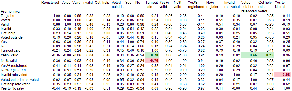
Note: Positive coefficients shaded green and negative coefficients shaded red are commented in the text above the matrix.
4. Polling stations with objections versus those without
The comparison between stations with and without objections is one of the most useful checks in the file because it introduces a simple internal contrast. If stations with objections systematically differed from those without them, that would be analytically interesting even on a small dataset.
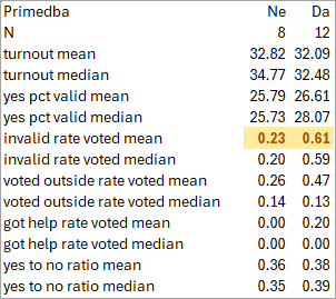
The results are mixed. On turnout, there is essentially no difference. Stations with objections and those without them look remarkably similar (32.09 vs. 32.82). The same is true for the Yes share (26.61 vs. 25.79). That means objections do not appear to cluster in a way that would obviously separate one type of referendum outcome from another.
The most notable difference concerns invalid-ballot rate. Stations with objections had somewhat higher invalid-ballot rates on average (0.61 vs. 0.23), and the Mann–Whitney result comes close to the usual significance threshold (.053). On such a small sample this should still be read cautiously, but it is one of the few places in the dataset where stations with objections appear to differ in a potentially meaningful way.
Outside voting and assisted voting do not show comparably clear separation between the two groups. The broader implication is that objections in Ada were not associated with a wholesale reconfiguration of turnout or Yes/No voting, but may have been linked, at least modestly, to ballot-validity issues.
5. Unusual polling stations: outliers and Top 3
On a small dataset, a handful of polling stations can matter a great deal. That is why the outlier analysis and Top 3 rankings are more than decorative additions: they help identify where the dataset is most internally uneven.
Polling Station 18 (Obornjača) is the clearest standout. It combines very high turnout, a very high Yes share, and an elevated assisted-voting rate. It is not marked by objection, but statistically it is one of the most distinctive stations in the entire sample. Polling Station 21 (Ada*) sits at the opposite end: extremely low turnout, extremely low Yes share, and correspondingly high No share. These two stations alone capture much of the spread in the referendum result.
The Mol stations also deserve attention. Stations 12 and 13 rank among the highest on turnout, while station 12 also tops the list for invalid-ballot rate. Since these stations overlap with objection-marked cases, they matter for both the descriptive and procedural reading of the dataset.
The Top 3 lists reinforce this point. Some of the stations with the highest turnout or highest invalid-ballot rate are also stations with objections. That does not prove anything by itself, but it helps identify the polling stations where a closer reading of commission reports or local circumstances would be most justified.




6. What else could be analyzed on such a limited dataset?
Even after all these checks, the dataset leaves room for further work. If we had more contextual information about Ada’s settlements, we could ask whether the referendum result differed systematically between more rural and more urbanized parts of the municipality. If we had historical electoral data at the polling-station level, we could compare the referendum pattern to earlier electoral behavior. If we had more detailed procedural documentation, we could evaluate whether stations with objections differed from others in additional administrative respects.
The point, however, is not to turn a small dataset into something it is not. On 21 polling stations, careful descriptive work is already useful. The value lies in showing how the referendum result was internally structured, not in forcing overly ambitious claims out of limited evidence.
7. Conclusion
The polling-station analysis of the Ada referendum adds nuance to the municipality-wide result. The overall No majority remains clear, but the internal structure of that result is uneven. Higher-turnout stations tended to be less negative toward the proposal. Stations with objections did not differ much in turnout or Yes share, but they may have had somewhat elevated invalid-ballot rates. Several stations stand out clearly and deserve closer attention in any further qualitative follow-up.
The safest overall conclusion is therefore a restrained one. The dataset does not support dramatic forensic claims. But it does support a structured account of how the referendum result was built and where the main internal points of variation lie. That, in itself, is valuable. In a local referendum, understanding the internal composition of the result is often more useful than trying to force the data into a stronger evidentiary framework than they can sustain.
8. Methodological note
This second part relies on polling-station level descriptive statistics, exploratory correlations, scatterplots of turnout and referendum outcome, comparison of stations with and without objections, Top 3 ranking by selected indicators, and Mann–Whitney tests. Because the number of polling stations is small, all inferential conclusions should be treated as suggestive. The purpose of the exercise is not to establish manipulation conclusively, but to summarize results, identify non-uniformity, and explain the internal logic of the referendum outcome in a transparent way.

Director of Wellington based My Statistical Consultant Ltd company. Retired Associate Professor in Statistics.
Has a PhD in Statistics and over 45 years experience as a university professor, consultant, international researcher and government advisor.